
Should My Cash-Pay Clinic’s Website Have a “Start Your Journey” Page? (What Goes On It — and What to Leave Off)
Most cash-pay clinic websites explain what the clinic treats. Almost none explain what actually happens after a prospect says yes—what they’ll pay to start, what gets tested, when the consult happens, and which program they’ll choose from. That gap is exactly what a “Start Your Journey” page closes. We recently redesigned one for a men’s-health and longevity practice we consult for, and the decisions from that project apply to nearly every cash-pay clinic. Here’s the FAQ.
Should my clinic website have a “Start Your Journey” page?
Yes—it’s the page that converts curiosity into a booked first step by showing prospects exactly what happens after they say yes.
During the redesign call, the owner kept returning to one point: “This is ultimately representing your personality and brand… this is an important page for us.” The page walks prospects through the sequence—a comprehensive blood panel, a lab appointment, a one-hour initial consultation, and then a program recommendation. As a result, the unknowns that often stall high-ticket health decisions disappear before the first phone call.
It also pulls double duty. Once it’s built, the page becomes the foundation for the informational PDF you email prospects after a discovery call. Build the page first in a design tool like Figma, where you control the layout. Then derive the follow-up assets from it. That gives you one source of truth for “how it works” everywhere a prospect looks. That’s the connective tissue of good functional medicine & longevity clinic marketing: the journey reads the same on the website, in the email, and in the consult room.
What should actually go on a Start Your Journey page?
The step-by-step path, real photos of your facility, and a program comparison a stranger can understand—all designed as a webpage, not a document dump.
This redesign centered on three components.
First, explain the steps. Show what the prospect does first, what it costs to get started, what the one-hour consultation includes, and what they choose afterward.
Second, use real photos that have been professionally enhanced. The reference page that inspired the redesign worked because “it feels like you’re there when you’re looking at the picture.” For that reason, the clinic provided its own office photography instead of relying on stock images.
Third, present the available programs as a true comparison. More on that below. At the same time, simplify your navigation. In this case, “Membership Programs” became the cleaner “Programs” dropdown, with membership options and longevity programs separated onto their own pages.
The owner’s repeated veto is worth adopting as a rule: “I don’t really want it to look like just a PDF file… more than just a PDF sticking there.”
If your Start Your Journey page is simply an embedded brochure, it’s not a webpage—it’s homework.
Should I put brand names like Prenuvo or TruAge on my clinic website?
No. De-brand the services. “Comprehensive blood panel” sells your clinic; a brand name sells the brand.
One of the strongest decisions during the redesign was renaming “lab work” to “comprehensive blood panel” while removing vendor names from the diagnostics.
The owner’s reasoning was commercial, not cosmetic.
“We made our diagnostic lab test generic on purpose—a lot of these places sell direct to consumer… that’s why I don’t like to use brand stuff.”
Every branded test on your website becomes a Google search that can send prospects somewhere else.
The exception is when a vendor explicitly provides marketing materials and permission through a true co-marketing arrangement.
Otherwise, describe the outcome instead of the logo. For example, say “a full hormone and metabolic panel, drawn in office,” rather than naming the diagnostic company.
The same thinking led the clinic to add “(in office)” beside lab work on the pricing page. The owner didn’t want patients “thinking I’m paying for whatever they want.”
How should the program comparison section be designed?
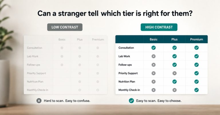
Design it so a first-time visitor can immediately tell the tiers apart.
High-contrast checkmarks and X’s outperform two columns that look nearly identical except for the price.
The owner’s critique of the previous layout was straightforward.
“It’s difficult to tell the difference between the two with the X’s or the checks.”
The bigger issue ran deeper.
“This doesn’t really allow the consumer to make a choice between which one’s right for them—it just makes them both look the same, other than the amount.”
When pricing becomes the only visible difference, visitors naturally anchor on price.
Instead, model the comparison after high-end longevity clinics. Use bold checkmarks, unmistakable X’s, and rows that clearly communicate the practical differences between each program.
One additional decision was equally intentional.
The membership tab shows that 12-month memberships exist without displaying the price. Prospects understand the commitment first. Then they discuss the investment during a conversation where the value can be explained.
How does the Start Your Journey page connect to the discovery-call process?
The page prepares prospects for the next step, while a structured 48-hour follow-up closes the loop.
At this clinic, every discovery call ends with a simple next step.
“It’s $600 to move forward—that covers your labs and your one-hour initial consultation.”
Because prospects have already seen the journey on the website, the investment feels expected rather than surprising.
For people who don’t book during the call, the clinic replaced its informal “check in next week” approach with a firm CRM task scheduled exactly 48 hours later.
Most objections—gathering previous labs, discussing the decision with a spouse, or simply thinking it over—resolve within that timeframe if the prospect remains engaged.
The team also eliminated one question entirely.
Instead of asking, “Do you have any questions?”, they moved to assumptive language such as:
“Did you see the lab times I sent? That’s the next step—scheduling labs and making payment.”
After that follow-up, the lead moves to either Booked or Lost.
There is no limbo.
The benchmark from this clinic was equally clear. Nearly every discovery call already converted (“everybody’s moved forward so far, except for two”). However, if closing ever falls below 90%, the process changes—for example, moving discovery calls to Zoom so providers can read facial expressions and build stronger rapport.
Should non-members pay more for follow-up visits?
Yes. This clinic set non-member follow-up visits at $300, making the membership value obvious without relying on a sales pitch.
Previously, follow-up visits cost $250 with one provider and $150 with another. Going forward, patients who decline a membership can still receive care—but they’ll pay $300 per follow-up visit.
The math quickly becomes compelling.
Quarterly visits alone cost a non-member $1,200 per year before labs or medications. As a result, the 12-month membership stops feeling like a pitch and starts looking like simple arithmetic.
As the owner put it:
“That incentivizes the membership even more.”
Two practical lessons also came from the discussion.
First, continue accepting non-members while your membership base is still growing. Those patients often refer spouses and friends. Once you reach roughly 20 to 30 active members, you can become more selective if capacity requires it.
Second, pricing protects your providers’ time.
The owner described patients who ordered labs, canceled appointments twice, and then returned months later asking for refills and advice.
“Annoyed that you’re working for free?”
“Yeah.”
A well-designed pricing structure prevents that pattern. Patients remain welcome, but an ongoing relationship requires an ongoing commitment. That’s the same operational discipline that allows a practice we work with to grow website leads by 900% in 4 months while retaining the value it creates.
FAQ’s About the Start Your Journey Page
What is a Start Your Journey page?
A Start Your Journey page is a dedicated webpage that shows prospects exactly what happens after they decide to become a patient.
It explains the first step, such as a comprehensive blood panel, the initial consultation, and the available programs. It also uses real photography and a clear comparison table to remove uncertainty and convert curiosity into a booked first step.
Should the page show membership pricing?
Show that 12-month memberships exist, but reserve the pricing discussion for the conversation.
In this clinic’s design, the membership tab introduces the commitment without displaying the price. Consequently, the investment is discussed during the discovery call, where its value can be compared against paying $300 per follow-up visit.
Should I embed my program PDF on the page instead?
No.
As the owner put it:
“I don’t want it to look like just a PDF sticking there.”
Instead, build a fully designed webpage first. Then reuse that content as the PDF you email after the discovery call.
The webpage educates new visitors. Meanwhile, the PDF reinforces the same message after they’ve spoken with your team.
How soon should we follow up after a discovery call?
Follow up within 48 hours.
Assign the task in your CRM to the person who conducted the discovery call. Then use assumptive language such as:
“Did you see the lab times I sent? That’s the next step—scheduling labs and making payment.”
Avoid asking, “Do you have any questions?”
Finally, move every lead to either Booked or Lost. Don’t leave prospects sitting in an indefinite follow-up stage.
Why charge non-members more for follow-up visits?
Charging more for follow-up visits protects your time while making membership the obvious financial choice.
At $300 per visit, quarterly follow-ups total $1,200 annually before labs and medications. Therefore, the membership naturally becomes the better value.
Equally important, this structure ends the cycle of patients requesting ongoing advice, medication refills, and provider time without maintaining an active paid relationship.
What’s the next step?
If your website explains what you treat but never explains what happens after someone says yes, you’re forcing every prospective patient to assemble the journey themselves—and most won’t.
Instead, give them a clear path.
Book a strategy call. In 60 minutes, we’ll outline your Start Your Journey page, map the patient journey, de-brand service names where appropriate, build a comparison table that makes choosing easier, and create a follow-up process that consistently turns discovery calls into booked lab appointments.